Configuration
Learn about general User Feedback configuration fields.
The User Feedback Widget offers many customization options, and if the available options are insufficient, you can use your own UI.
The following configuration options apply to version 8.0.0 and above of the JavaScript SDK. The Feedback Widget in version 7 of the SDK was a beta release and is now deprecated.
The following options can be configured for the integration in feedbackIntegration({}):
| Key | Type | Default | Description |
|---|---|---|---|
autoInject | boolean | true | Injects the Feedback widget into the application when the integration is added. Set autoInject: false if you want to call feedback.attachTo() or feedback.createWidget() directly, or only want to show the widget on certain views. |
showBranding | boolean | true | Displays the Sentry logo inside of the form. |
colorScheme | "system" | "light" | "dark" | "system" | Shows the color theme choices. "system" will use your OS color scheme. |
id | string | sentry-feedback | The id attribute of the <div> that contains the feedback widget. See CSS Customization for more. |
tags | Record<string, number | string | boolean | bigint | symbol | null | undefined> | {} | Tags to set on the feedback event. |
Whether you want to use auto-injection, or manually control things, the integration must first be passed via the integrations array into Sentry.init().
If you have autoInject: true a button will be inserted into the page that triggers the form to pop up so the user can enter their feedback. If instead you want to control when this injection happens, call the feedback.createWidget() method to get a reference to an Actor object, and then call appendToDom() to insert it into the page.
Sentry.init({
dsn: "https://examplePublicKey@o0.ingest.sentry.io/0",
integrations: [
Sentry.feedbackIntegration({
// Disable the injection of the default widget
autoInject: false,
}),
],
});
// Get the instance returned by `feedbackIntegration()`
const feedback = Sentry.getFeedback();
// Create and render the button
const widget = feedback?.createWidget();
// Later, when it's time to clean up:
widget.removeFromDom();
Read more about how to use your own UI below.
The following options can be configured for the integration in feedbackIntegration({}):
| Key | Type | Default | Description |
|---|---|---|---|
showName | boolean | true | Displays the name field on the feedback form. |
showEmail | boolean | true | Displays the email field on the feedback form. |
enableScreenshot | boolean | true | Allows the user to send a screenshot attachment with their feedback. For self-hosted, release 24.4.2 is also required. |
isNameRequired | boolean | false | Requires the name field on the feedback form to be filled in. |
isEmailRequired | boolean | false | Requires the email field on the feedback form to be filled in. |
useSentryUser | Record<string, string> | { email: 'email', name: 'username'} | Sets the email and name fields to the corresponding Sentry SDK user fields that were called with Sentry.setUser. |
If you've set a user context by calling Sentry.setUser(), those values will be used as defaults for the name and email fields. If those fields are hidden from the user, the default values will still be sent along with the feedback message.
Below is an example configuration with non-default user fields.
Sentry.setUser({
fullName: "Jane Doe",
email: "foo@example.com",
});
Sentry.init({
dsn: "https://examplePublicKey@o0.ingest.sentry.io/0",
integrations: [
Sentry.feedbackIntegration({
useSentryUser: {
name: "fullName",
email: "email",
},
}),
],
});
Most text that you see in the default Feedback widget can be customized.
The following options can be configured for the integration in feedbackIntegration({}):
| Key | Default | Description |
|---|---|---|
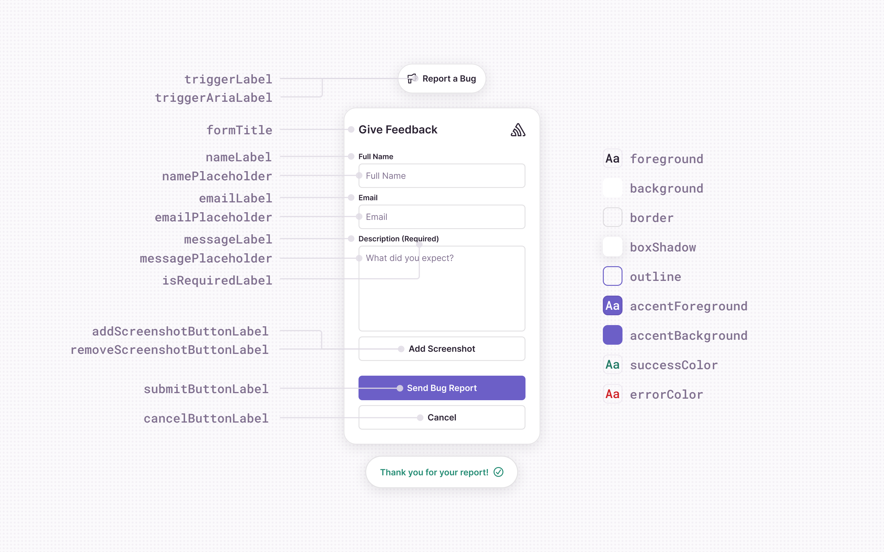
triggerLabel | "Report a Bug" | The label of the injected button that opens up the feedback form when clicked. |
triggerAriaLabel | triggerLabel || "Report a Bug" | The aria label of the injected button that opens up the feedback form when clicked. Available starting in SDK v8.20.0. |
formTitle | "Report a Bug" | The title at the top of the feedback form. |
submitButtonLabel | "Send Bug Report" | The label of the submit button used in the feedback form. |
cancelButtonLabel | "Cancel" | The label of cancel buttons used in the feedback form. |
confirmButtonLabel | "Confirm" | The label of confirm buttons used in the feedback form. |
addScreenshotButtonLabel | "Add a screenshot" | The label of the button to add a screenshot to the form. |
removeScreenshotButtonLabel | "Remove screenshot" | The label of the button to remove the screenshot from the form. |
nameLabel | "Name" | The label of the name input field. |
namePlaceholder | "Your Name" | The placeholder for the name input field. |
emailLabel | "Email" | The label of the email input field. |
emailPlaceholder | "your.email@example.org" | The placeholder for the email input field. |
isRequiredLabel | "(required)" | The label shown next to an input field that is required. |
messageLabel | "Description" | The label for the feedback description input field. |
messagePlaceholder | "What's the bug? What did you expect?" | The placeholder for the feedback description input field. |
successMessageText | "Thank you for your report!" | The message displayed after a successful feedback submission. |
Example of customization:
Sentry.init({
dsn: "https://examplePublicKey@o0.ingest.sentry.io/0",
integrations: [
Sentry.feedbackIntegration({
buttonLabel: "Feedback",
submitButtonLabel: "Send Feedback",
formTitle: "Send Feedback",
}),
],
});
You can customize placement of the feedback components on your page, as well as the fonts and theme colors for light and dark mode.
In all cases, you can set CSS variables to override any value. By default, the <div> container has the attribute id="sentry-feedback", so you can use the #sentry-feedback selector to define CSS variables to override defaults.
The example below shows how to customize the background color for the light and dark themes by overriding CSS variables:
#sentry-feedback {
  --trigger-background: #cccccc;
}
@media (prefers-color-scheme: dark) {
  #sentry-feedback {
    --trigger-background: #222222;
  }
}
Alternatively, you can also do the same thing by setting theme values in JavaScript:
Sentry.init({
dsn: "https://examplePublicKey@o0.ingest.sentry.io/0",
integrations: [
Sentry.feedbackIntegration({
themeLight: {
background: "#cccccc",
},
themeDark: {
background: "#222222",
},
}),
],
});
The following values are only available as CSS variables, and apply to both dark and light themes.
| CSS Variable | Default | Description |
|---|---|---|
--font-family | "system-ui, 'Helvetica Neue', Arial, sans-serif" | The default font-family to use. |
--font-size | 14px | The font size. |
--z-index | 100000 | The z-index of the widget. |
--inset | auto 0 0 auto | By default, the widget has fixed position, and is in the bottom right corner. |
--page-margin | 16px | The margin from the edge of the screen that the widget should be positioned. This also accepts shorthand values like 10px 20px 30px 10px for top/right/bottom/left margins. |
Colors can be customized by by defining CSS variables that override the default values, or by passing themeLight and/or themeDark to feedbackIntegration({}).
| CSS Variable | Configuration Key | Default Light Mode | Default Dark Mode | Description |
|---|---|---|---|---|
--foreground | foreground | #2b2233 | #ebe6ef | Foreground (text) color. |
--background | background | #ffffff | #29232f | Background color of the widget (injected button and form). |
--accent-foreground | accentForeground | #ffffff | #ffffff | Foreground color for the submit button. |
--accent-background | accentBackground | rgba(88, 74, 192, 1) | rgba(88, 74, 192, 1) | Background color for the submit button. |
--success-color | successColor | #268d75 | #2da98c | Color used for success-related components (such as text color when feedback is submitted successfully). |
--error-color | errorColor | #df3338 | #f55459 | Color used for error related components (such as text color when there's an error submitting feedback). |
--box-shadow | boxShadow | 0px 4px 24px 0px rgba(43, 34, 51, 0.12) | 0px 4px 24px 0px rgba(43, 34, 51, 0.12) | Box shadow style used for the widget (injected button and form). |
--outline | outline | 1px auto var(--accent-background) | 1px auto var(--accent-background) | Outline for form inputs when focused. |
CSS variables take priority over configuration values in feedbackIntegration(). In this example, the configuration makes it seem like the text could be either white or black, but because there is a CSS variable set, the text will always be red.
<script>
Sentry.init({
dsn: "https://examplePublicKey@o0.ingest.sentry.io/0",
integrations: [
Sentry.feedbackIntegration({
themeLight: {
foreground: "#000",
},
themeDark: {
foreground: "#fff",
},
}),
],
});
</script>
<style>
#sentry-feedback {
--foreground: "red"; /* overrides both `#fff` and `#000` above */
}
</style>
It’s possible to set the id configuration value to something other than the default sentry-feedback and use that as a selector when overriding CSS variables.
<script>
Sentry.init({
dsn: "https://examplePublicKey@o0.ingest.sentry.io/0",
integrations: [
Sentry.feedbackIntegration({
id: "feedback-theme", // The default is 'sentry-feedback'
}),
],
});
</script>
<style>
/* Target the custom id */
#feedback-theme {
--foreground: "red";
}
</style>
Because it’s sometimes useful to know when a user started interacting with the feedback form, we've made it possible for you to add custom logging, or start and stop background timers on the page that tell you when the user is done.
The following options can be configured for the integration in feedbackIntegration({}):
Sentry.init({
dsn: "https://examplePublicKey@o0.ingest.sentry.io/0",
integrations: [
Sentry.feedbackIntegration({
onFormOpen: () => {},
onFormClose: () => {},
onSubmitSuccess: (data: FeedbackFormData) => {},
onSubmitError: (error: Error) => {},
}),
],
});
You can use your own button instead of the default injected button to trigger the form being displayed, by calling feedback.attachTo() to have the SDK attach a click listener to your button. You can also supply the same customization options that the constructor accepts (for example, for text labels and colors).
Sentry.init({
dsn: "https://examplePublicKey@o0.ingest.sentry.io/0",
integrations: [
Sentry.feedbackIntegration({
// Disable the injection of the default widget
autoInject: false,
}),
],
});
// Get the instance returned by `feedbackIntegration()`
const feedback = Sentry.getFeedback();
feedback?.attachTo(document.querySelector("#your-button"), {
formTitle: "Report a Bug!",
});
Alternatively, you can call feedback.createForm() and have full control over when the form gets loaded, added to the dom, and finally shown to the user.
Sentry.init({
dsn: "https://examplePublicKey@o0.ingest.sentry.io/0",
integrations: [
Sentry.feedbackIntegration({
// Disable the injection of the default widget
autoInject: false,
}),
],
});
// Get the instance returned by `feedbackIntegration()`
const feedback = Sentry.getFeedback();
const form = await feedback?.createForm();
form.appendToDom();
form.open();
You can also use your own UI components to gather feedback and pass the feedback data object to the captureFeedback() function. The captureFeedback function accepts two parameters:
- A JavaScript object with a required
messageproperty and also optionalnameandemailproperties. - An optional "hints" object.
Sentry.captureFeedback(
  {
    name: "Jane Doe", // optional
    email: "email@example.org", // optional
    message: "This is an example feedback", // required
  },
  {
    includeReplay: true, // optional
    attachments: [], // optional
  },
);
Here's a simple example:
<form id="my-feedback-form">
  <input name="name" placeholder="Your Name" />
  <input name="email" placeholder="Your Email" />
  <textarea name="message" placeholder="What's the issue?" />
  <input type="file" name="attachment" />
  <button type="submit">Submit</button>
</form>
Because the feedbackIntegration is a user-facing integration, we offer two loading strategies that have bundle size implications.
For most users, we recommend using feedbackIntegration in your Sentry.init call. This will set up user feedback with good defaults, matching the environment.
All of the code examples on this page use feedbackIntegration as a default because it's available regardless of whether you've chosen the CDN or NPM installation method. However, the implementation of feedbackIntegration is different for the two installation methods. For NPM users, feedbackIntegration is an alias of feedbackSyncIntegration. For CDN users, feedbackIntegration is an alias of feedbackAsyncIntegration.
If you've installed the SDK with NPM, this loading strategy is used by default. The strategy isn't available if you've installed the SDK via the CDN.
This integration includes all the code needed to render the "Send Feedback" button, as well as the form that is triggered when the button is clicked. Choosing this loading strategy means accepting the largest upfront bundle size in your application. The benefit of this is that the feedback widget is guaranteed to open when the user interacts with it, but in either case, network connectivity is required to send the feedback message.
If you installed the SDK with the CDN, this loading strategy is used by default. If you used NPM, you can still choose to use this loading strategy by adding this integration to your Sentry.init call.
This integration includes the minimum amount of code needed upfront to show the "Send Feedback" button on the screen when the page is loaded. When the user clicks on that button, the integration will asynchronously load internal integrations from https://browser.sentry-cdn.com that show the form and let the user type out their feedback message. This has the benefit of being the smallest bundle size. The drawback is that asynchronous loading can fail if, for example, the user has an ad-blocker.
For CDN users feedbackIntegration is an alias of feedbackAsyncIntegration.
import * as Sentry from "@sentry/browser";
Sentry.init({
dsn: "https://examplePublicKey@o0.ingest.sentry.io/0",
integrations: [
// Use the default strategy, an alias for `feedbackAsyncIntegration`
Sentry.feedbackIntegration({
// Additional SDK configuration goes in here, for example:
colorScheme: "system",
}),
],
});
For NPM users feedbackIntegration is an alias of feedbackSyncIntegration.
import * as Sentry from "@sentry/browser";
Sentry.init({
dsn: "https://examplePublicKey@o0.ingest.sentry.io/0",
integrations: [
// Use the default strategy, an alias for `feedbackSyncIntegration`
Sentry.feedbackIntegration({
// Additional SDK configuration goes in here, for example:
colorScheme: "system",
}),
],
});
You can customize the Crash-Report modal to your organization's needs, for example, for localization purposes. All options can be passed through the Sentry.showReportDialog call.
| Param | Default |
|---|---|
eventId | Manually set the id of the event. |
dsn | Manually set dsn to report to. |
user | Manually set user data [an object with keys listed below]. |
user.email | User's email address. |
user.name | User's name. |
lang | [automatic] – (Override for Sentry’s language code.) |
title | It looks like we’re having issues. |
subtitle | Our team has been notified. |
subtitle2 | If you’d like to help, tell us what happened below. – (Not visible on small screen resolutions.) |
labelName | Name |
labelEmail | |
labelComments | What happened? |
labelClose | Close |
labelSubmit | Submit |
errorGeneric | An unknown error occurred while submitting your report. Please try again. |
errorFormEntry | Some fields were invalid. Please correct the errors and try again. |
successMessage | Your feedback has been sent. Thank you! |
onLoad | n/a - (An optional callback that will be invoked when the widget opens.) |
onClose | n/a - (An optional callback that will be invoked when the widget closes.) |
The optional callback onLoad will be called when users see the widget. You can use this to run custom logic, for example to log an analytics event:
Sentry.showReportDialog({
  // ...
  onLoad() {
    // Log an event to amplitude when the report dialog opens
    amplitude.logEvent("report_dialog_seen");
  },
});
The optional callback onClose will be called when users close the widget. You can use this to run custom logic, for example to reload the page:
Requires JS SDK version v7.82.0 or higher.
Sentry.showReportDialog({
  // ...
  onClose() {
    // Refresh the window after the user closes the report dialog
    win.reload();
  },
});
Our documentation is open source and available on GitHub. Your contributions are welcome, whether fixing a typo (drat!) or suggesting an update ("yeah, this would be better").