Differential Flame Graphs
Learn how to use and interpret differential flame graphs.
There are multiple ways to visualize and use profiling data, including differential flame graphs, which can help easily identify function regressions or changes in the execution context.
Differential flame graphs are graph visualizations that highlight how the call stack frequencies of a program have changed, a task which can be tedious without them. They're often used in analysis for finding function regressions and understanding which functions got slower, faster, or were newly added. Keep in mind that differential flame graphs aren't really a new concept, but just aggregate flame graphs drawn using the colors generated by the diff of the two.
In Sentry, differential flame graphs are shown whenever a function regression is detected. When a regression happens, Sentry generates two aggregate flame graphs. One from the period leading up to the regression, and another from the time right after it. A differential flame graph is then used to visualize the difference between the two.
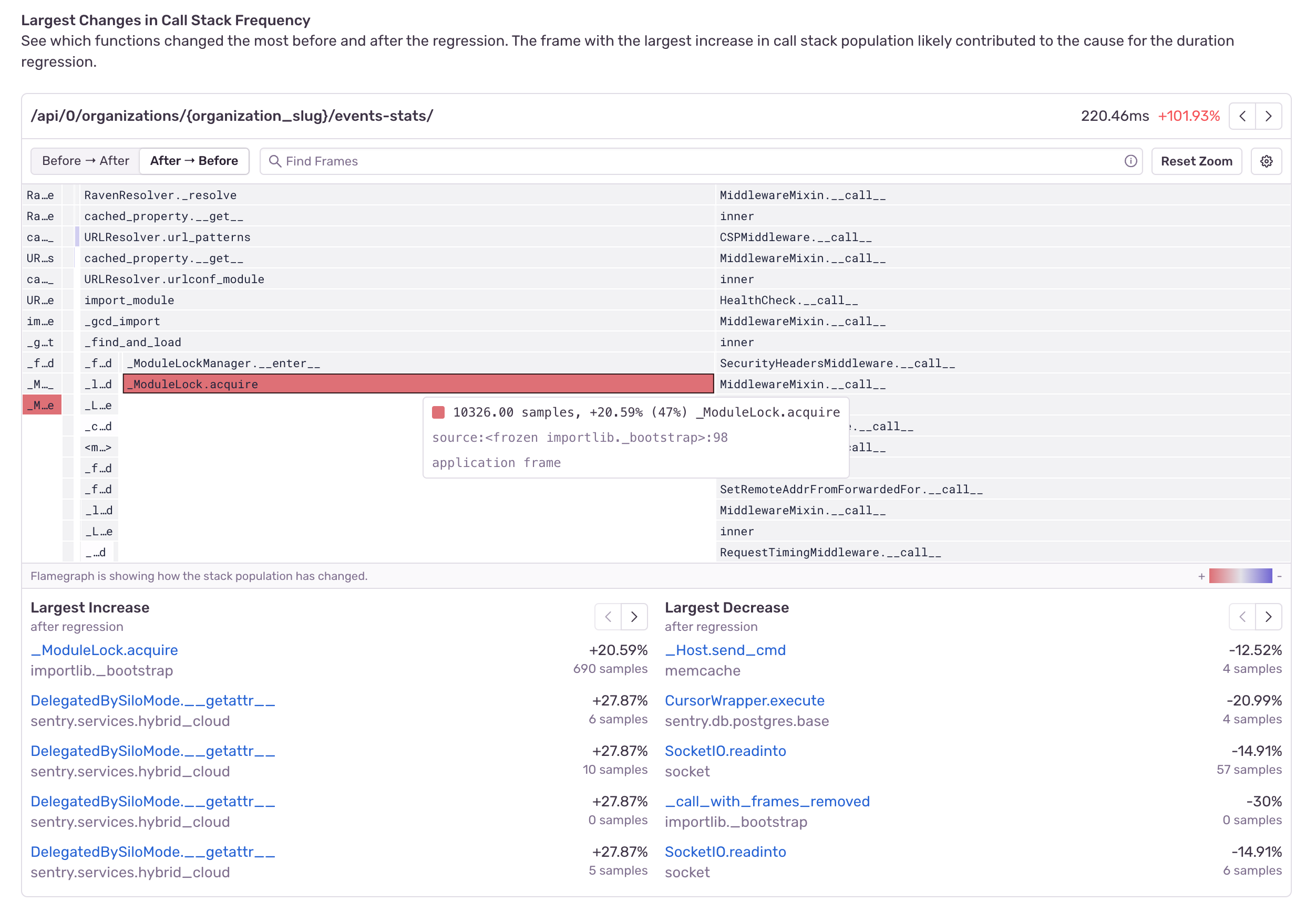
In a differential flame graph, the color red means that a function's execution time has increased or that there's a newly present function. The color blue means that the execution time has decreased.
Be on the lookout for red frames when interpreting differential flame graphs. They're the reason why your application code has been performing worse.
The differential flame graph above is showing that the function call to ModuleLock.acquire has increased in duration, hinting at a lock contention problem which is slowing down the code.
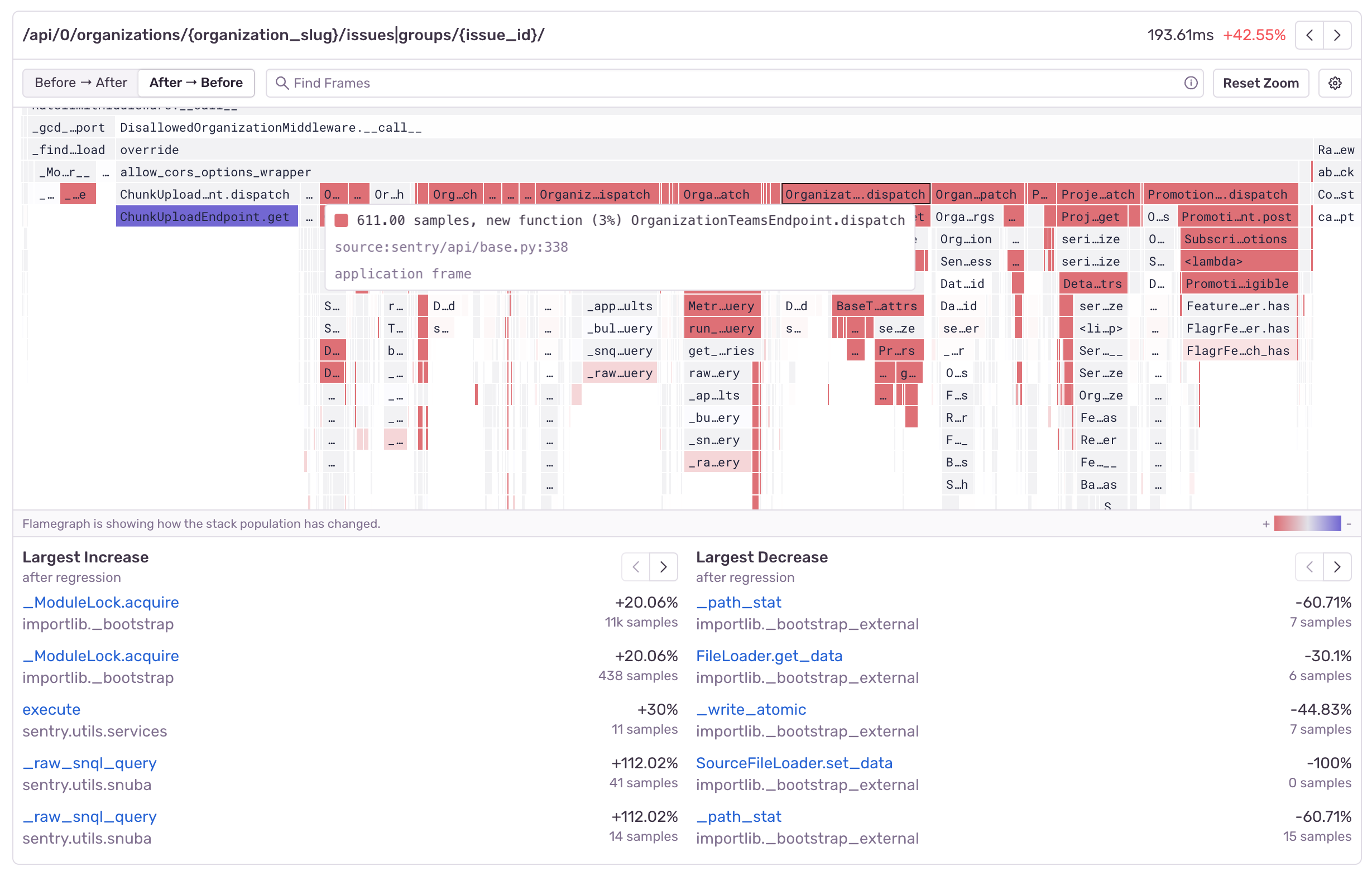
Let's look at another example:
The above differential flame graph shows that new function calls to OrganizationTeamsEndpoint.dispatch were introduced, which made the code run slower, while calls to ChunkUploadEndpoint.get decreased.
If you look closely, you'll notice that the top right corner has a Before -> After and After -> Before toggle. This is because by default, differential flame graphs draw the aggregate flame graph from after a regression has occurred as the source of truth. This means that any code that may have been removed, will no longer be drawn (after all, it's not there anymore). This is why negating the view is useful, as it allows us to compare the data from before and peek into the future of how our code will change.
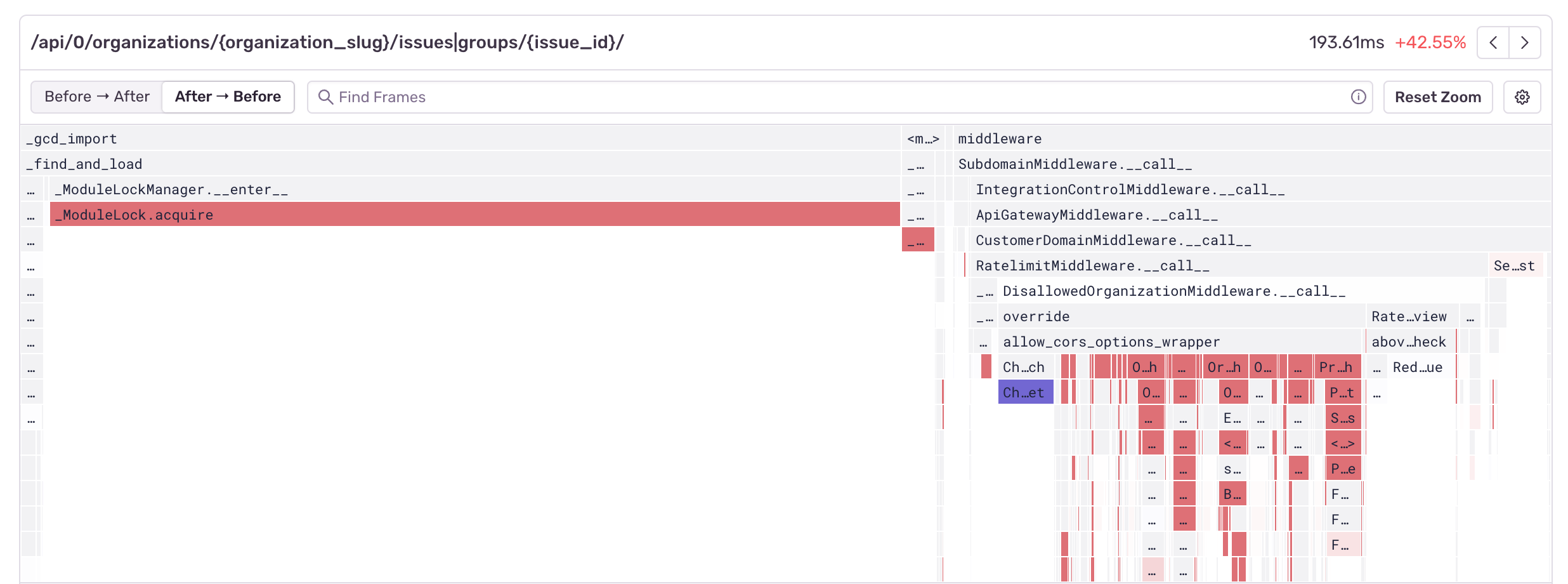
`` Here's an example of what our module lock problem looks like when using the profiling data from after the regression has occurred as the source of truth:
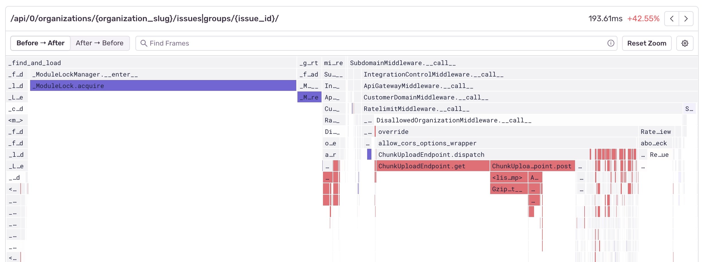
And here's what it looks like if we're using the data from before the regression occurred as our source of truth:
By using the Before -> After toggle we can see that ModuleLock.acquire was faster before the regression, but we can also see some of the function calls inside our ChunkUploadEndpoint, which are no longer being called.
While differential flame graphs in Sentry use a different color scheme and pull from a different source of data than regular flame graphs, you can pan and zoom around the chart and search for frames the same way you do with regular flame graph.
The table under the differential flame graph shows both the largest increases and the largest decreases in function duration.
Differential flame graphs are a good way to quickly visualize potential sources of performance regressions or improvements. Currently, they're only available as part of the automated function regression workflow, but we're working on adding them to other parts of the profiling workflow.
Our documentation is open source and available on GitHub. Your contributions are welcome, whether fixing a typo (drat!) or suggesting an update ("yeah, this would be better").


